Back
Navigating Locations Beyond Traditional Maps
Navigating Locations Beyond Traditional Maps
Navigating Locations Beyond Traditional Maps

Who are STRYDE?
Who are STRYDE?
Who are STRYDE?
STRYDE, a pioneer in seismic imaging technology, embarked on a mission to make this complex field accessible to a wider range of industries beyond oil and gas.
As a UX designer at STRYDE, I was working across various software platforms and collaborating with a team of expert engineers. Our mission: modernise seismic imaging software to make it affordable, user-friendly, and highly efficient for a diverse range of clients. While our products operate behind the scenes, I'm thrilled to share a compelling story about one of our most remarkable challenges and the innovative, user-centric solution we devised.
The Challenge
The Challenge
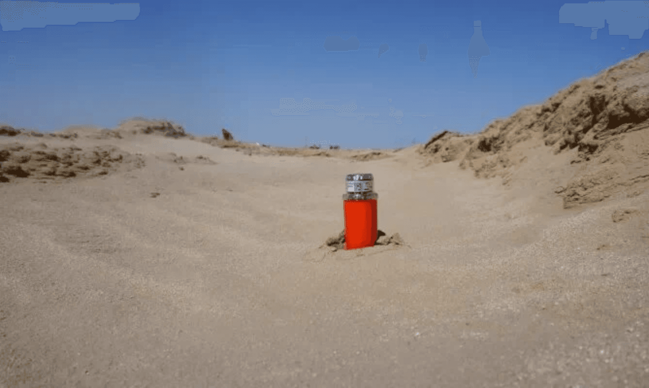
Nodes, often numbering in the hundreds of thousands, are meticulously deployed with centimetre accuracy across diverse terrains, including deserts, forests, mountains, and even Antarctica.
Our current plan status had been rated ‘not usable’ by internal and external users - it needed an overhaul!
Why? It didn’t aid them in their role and needed to be massively manipulated to make the data make sense
Discovery
Discovery
Listening to the stakeholders
Listening to the stakeholders
I began my journey by collaborating closely with our field support team, who work directly with our clients, managing STRYDE systems in the field. From this I:
Identified more users than we currently have this screen designed for
It’s not just reporting it is required for
Map’s are not helpful when there are no land marks for planning
I learnt how plans are made, equal distances between nodes to create a grid pattern
As the sole designer, I had to think about how might we aid deployment efforts by
As the sole designer, I had to think about how might we aid deployment efforts by
As the sole designer, I had to think about how might we aid deployment efforts by
improve visibility of deployment progress
improve visibility of deployment progress
improve visibility of deployment progress
Ensuring accuracy of deployment
Ensuring accuracy of deployment
Ensuring accuracy of deployment
facilitate navigational planning
facilitate navigational planning
facilitate navigational planning
This will ensure comprehensive analysis of the land being surveyed and provide accurate data.
This will ensure comprehensive analysis of the land being surveyed and provide accurate data.
This will ensure comprehensive analysis of the land being surveyed and provide accurate data.
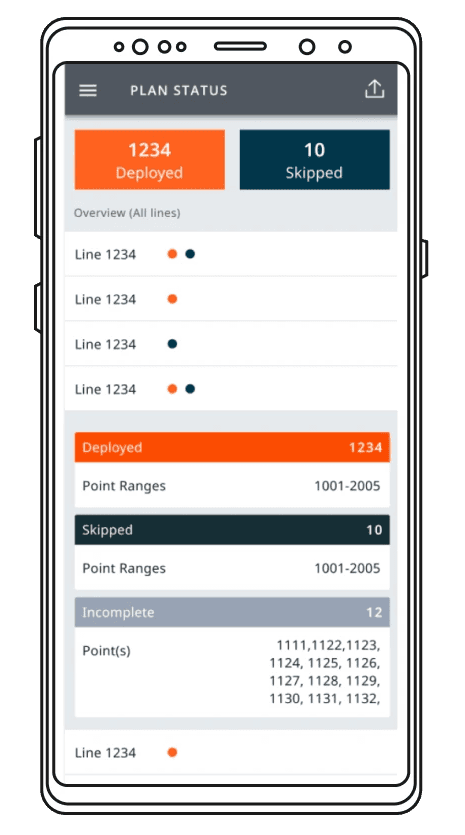
“I don’t care about what has been done, I need to know what is left to do”
Alan, Field Manager for Australasia
Identified users
Identified users
👷♀
Navigators
responsible for deploying and collecting nodes in teams;
What have I got left to do?
Am I working on the right piece of work?
👨💼
Foremen
manage and organise the Navigator teams
manage and organise the Navigator teams
manage and organise the Navigator teams
Ensure deployment is accurate
Ensure deployment is completed on time
🧑💻
Data Officer
Data Officer/Survey QC
Ensuring Data quality
Ensuring Data quality
Ensuring Data quality
Work with the foreman to ensure accurate deployment
Manage any changes required to maintain data quality
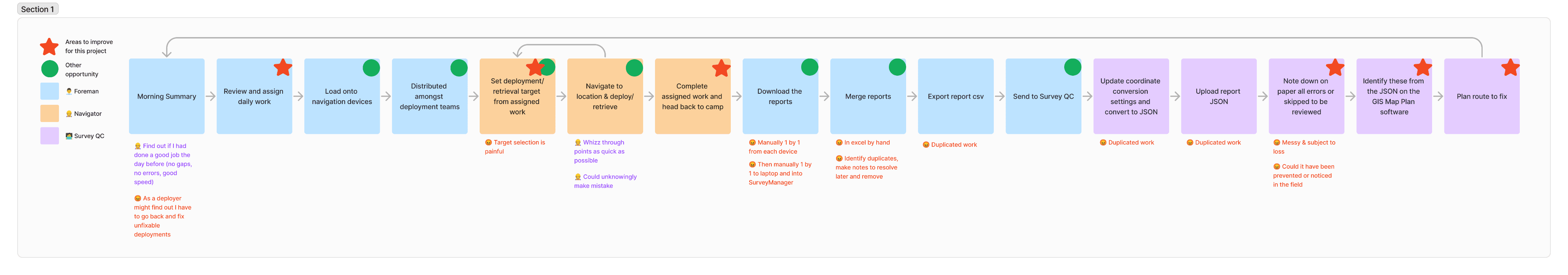
Current journey
Current journey
Design
Design
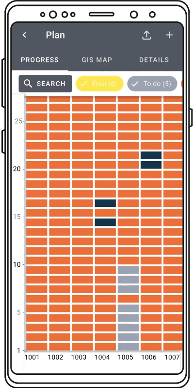
I started with sketches that I presented during initial meetings with the field support team. These sketches were a response to the problems and insights gleaned from conversations with the team. They addressed questions such as how much work remained, tracking work duration, and presenting a better summary. I also considered whether a map-like visualisation, similar to OpenTable maps, might be more effective or if progress bars would be preferable to numerical data.
The brief became:
demonstrate location in relation to other points
Allows users to plan routes
Can handle 150,000 points
Clearly identifies the status of EACH point as well as a summary of the plan
Allow users to see just their work or the entire plan
I focused on refining these ideas, hoping to uncover usability issues quickly through prototypes.
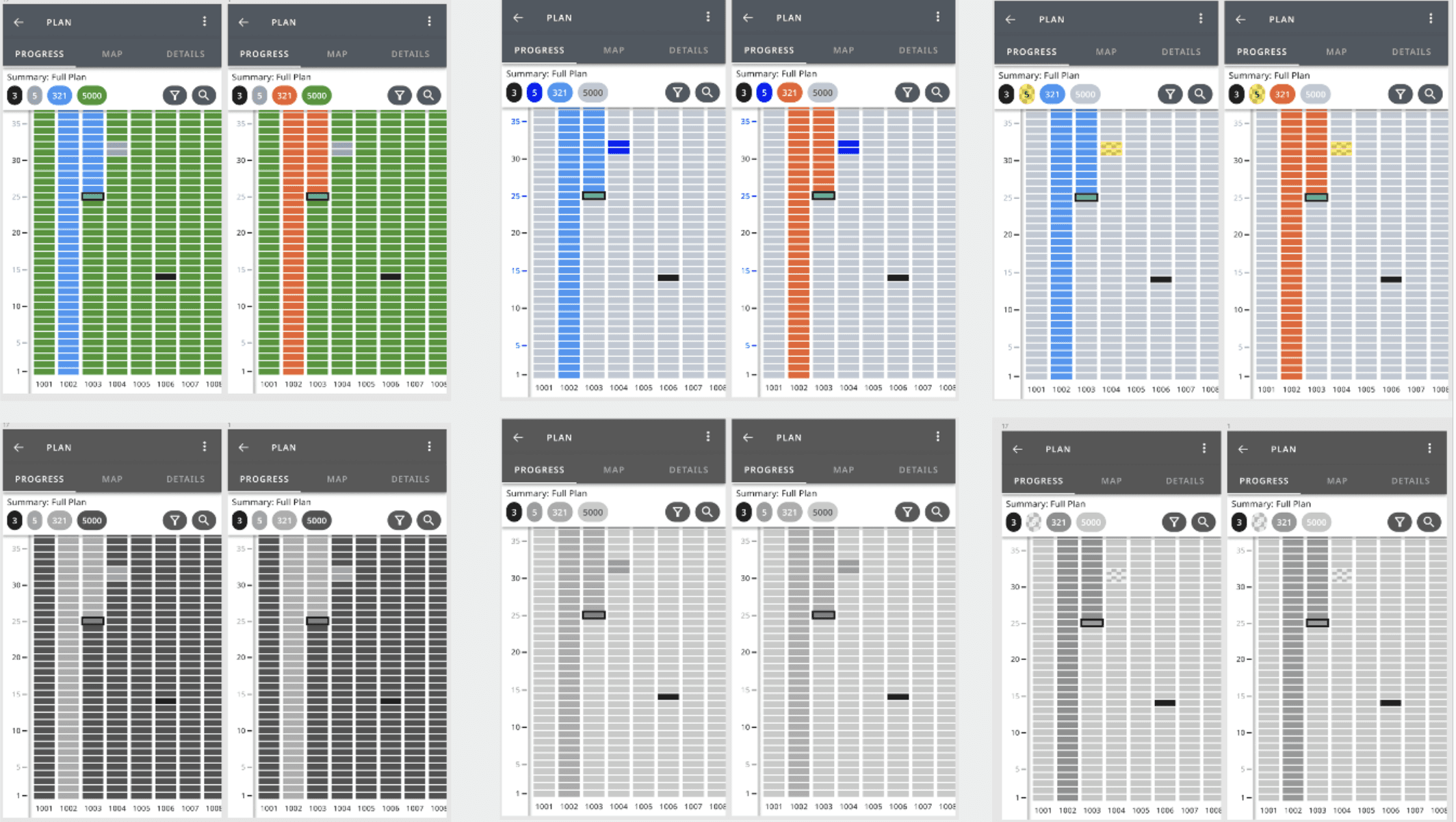
4 prototypes
4 rounds of testing with prototype changes in between
15 internal tests
Across different company roles
1 external test
with interview
Learnings
Learnings
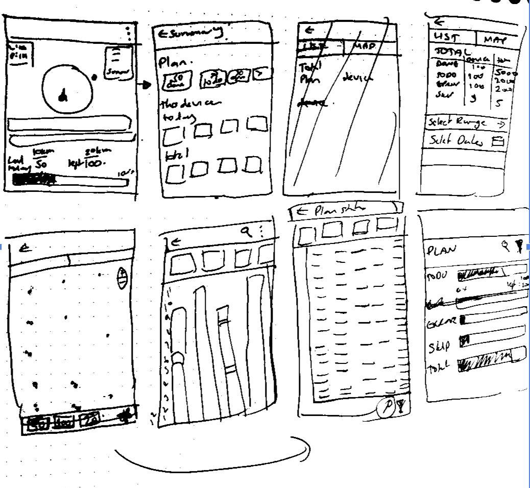
Scroll
Scroll
For our users since the relationship of the vertical and horizontal axis was crucial for visualising their plans in the field.
For our users since the relationship of the vertical and horizontal axis was crucial for visualising their plans in the field.
For our users since the relationship of the vertical and horizontal axis was crucial for visualising their plans in the field.
The assumed vertical scrolling doesn’t work in this instance.
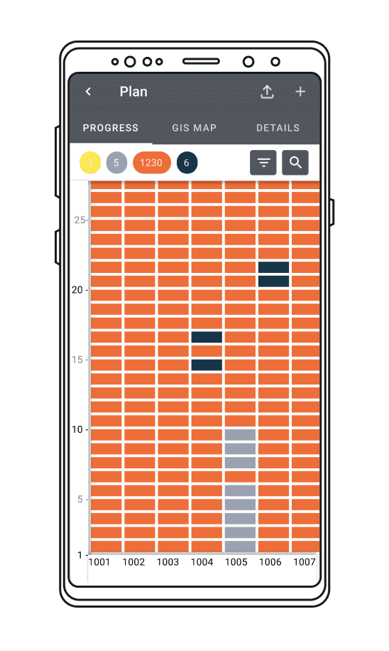
We altered the layout to match how Data Officers and Foremen typically envisioned the plans in a grid with an X and Y axis starting at 0,0..
The assumed vertical scrolling doesn’t work in this instance.
We altered the layout to match how Data Officers and Foremen typically envisioned the plans in a grid with an X and Y axis starting at 0,0..
The assumed vertical scrolling doesn’t work in this instance.
We altered the layout to match how Data Officers and Foremen typically envisioned the plans in a grid with an X and Y axis starting at 0,0..
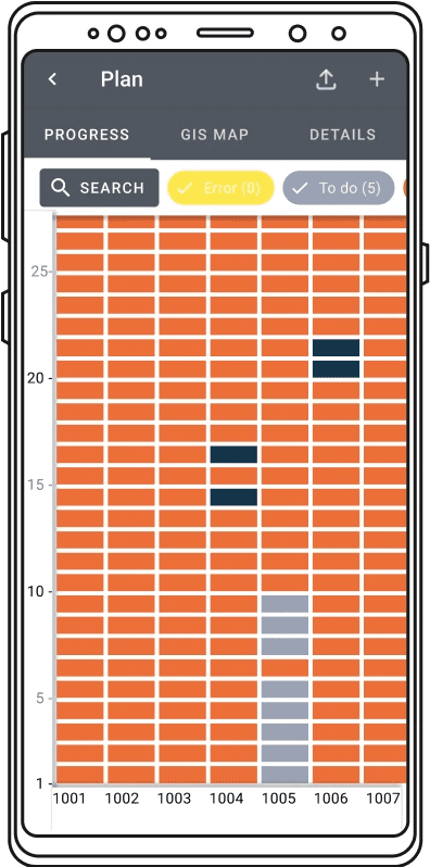
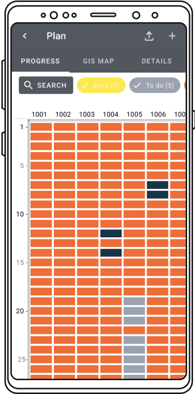
The first prototype
Iteration to scrolling to be like a graph
Filtering
Filtering
Navigation
Navigation
Navigation
Our commitment to the Material Design System 2.0 initially led us to use filter chips for user control over plan status. However;
users did not understand the on/off states of the chips
Did not realise they could be used to filter
Our commitment to the Material Design System 2.0 initially led us to use filter chips for user control over plan status. However;
users did not understand the on/off states of the chips
Did not realise they could be used to filter
Our commitment to the Material Design System 2.0 initially led us to use filter chips for user control over plan status. However;
users did not understand the on/off states of the chips
Did not realise they could be used to filter
Changing to a filter icon and drop down improved user comprehension from 100% failure to a 100% pass rate in user testing
Changing to a filter icon and drop down improved user comprehension from 100% failure to a 100% pass rate in user testing
Changing to a filter icon and drop down improved user comprehension from 100% failure to a 100% pass rate in user testing
The filters on the first prototype as ‘Chips’
Iteration to have chips to show the count of each status and using clearer filter and search icons for actions
Usability and workflows
Usability and workflows
Usability and workflows
Further user research during the usability testing phase revealed a crucial element missing in our plan status interface: a way for Navigators to focus on their specific tasks, which are often assigned by Foremen. To address this, we integrated a feature within the filter dropdown, allowing Navigators to view their designated tasks while still using other filters.
Further user research during the usability testing phase revealed a crucial element missing in our plan status interface: a way for Navigators to focus on their specific tasks, which are often assigned by Foremen. To address this, we integrated a feature within the filter dropdown, allowing Navigators to view their designated tasks while still using other filters.
Further user research during the usability testing phase revealed a crucial element missing in our plan status interface: a way for Navigators to focus on their specific tasks, which are often assigned by Foremen. To address this, we integrated a feature within the filter dropdown, allowing Navigators to view their designated tasks while still using other filters.
Colour
Colour
We had a predefined use of colour which didn’t really emphasise the goal of all of our users.
We had a predefined use of colour which didn’t really emphasise the goal of all of our users.
We had a predefined use of colour which didn’t really emphasise the goal of all of our users.
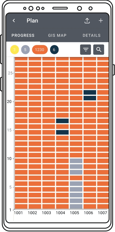
What is left to do?
What is left to do?
What is left to do?
So we reworked the colour orders and you can see that we have greater prominence on whats left to do, or not right than what is done. We also worked to improve our accessibility as the majority of users are men, and 2 colleagues were colour blind.
So we reworked the colour orders and you can see that we have greater prominence on whats left to do, or not right than what is done. We also worked to improve our accessibility as the majority of users are men, and 2 colleagues were colour blind.
So we reworked the colour orders and you can see that we have greater prominence on whats left to do, or not right than what is done. We also worked to improve our accessibility as the majority of users are men, and 2 colleagues were colour blind.
Original status colours
To do
Deployed
Retrieved
Skipped
New status colours
Deployed
To deploy
To retrieve
Skipped

Error
A new requirement
A new requirement
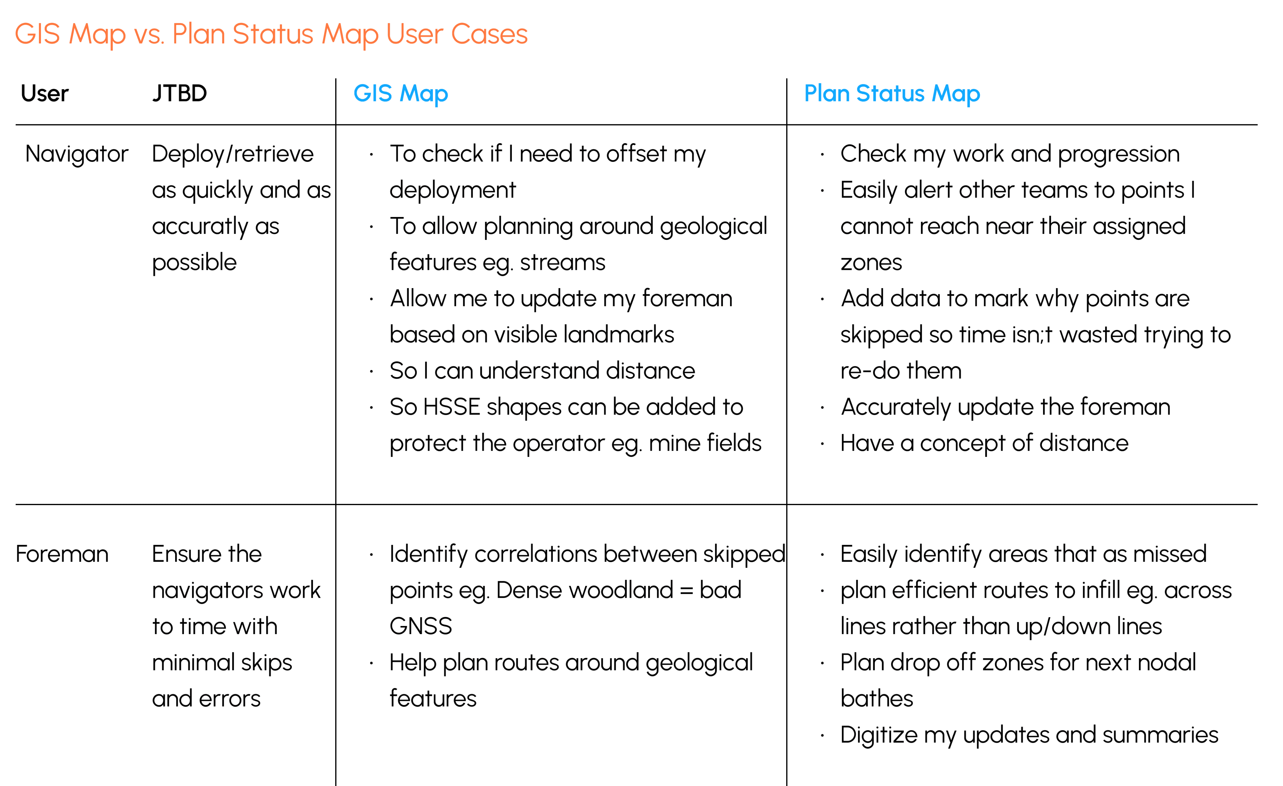
Due to cost we had always avoided having a GIS (geographic information system) Map but the research has suggested that we should provide both.
The Plan Status Map, allows the users to see groups of areas to fix or do, plan segments and work out efficient clusters of work for different teams.
The GIS map solves different but also important use cases particularly for the foreman and the navigators. This new requirement was proposed the Product Manager with the below and was taken onboard, but due to our iterative current MVP style of building this will come later as there are workaround using software on the laptops.
Conclusion
Conclusion
There was a highlight moment during the external user test with OceanaicGeo CEO,
”Is this real? When can we start using it?”
I did identify other areas of improvement and opportunities to improve STRYDE for these three personas as part of this journey which I have included below.
There was a highlight moment during the external user test with OceanaicGeo CEO,
”Is this real? When can we start using it?”
I did identify other areas of improvement and opportunities to improve STRYDE for these three personas as part of this journey which I have included below.
There was a highlight moment during the external user test with OceanaicGeo CEO,
”Is this real? When can we start using it?”
I did identify other areas of improvement and opportunities to improve STRYDE for these three personas as part of this journey which I have included below.
Original Plan Status
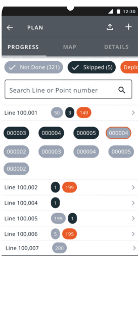
First design without discovery
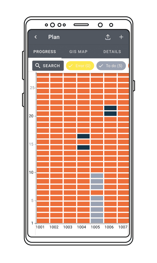
First prototype after initial stake holder session
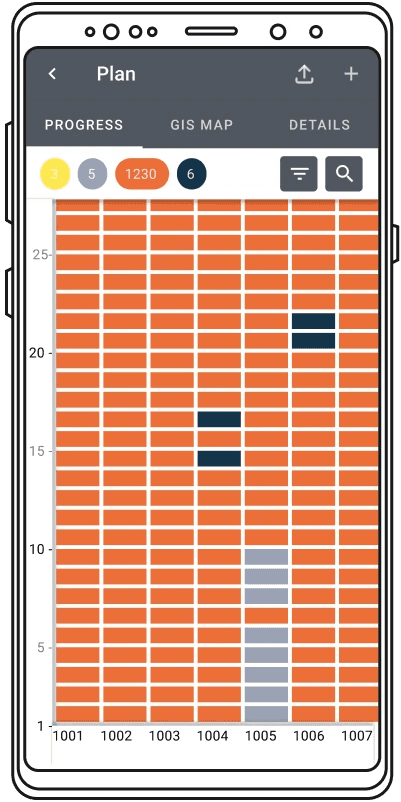
4th and final prototype
Other opportunities this project highlighted
Other opportunities this project highlighted
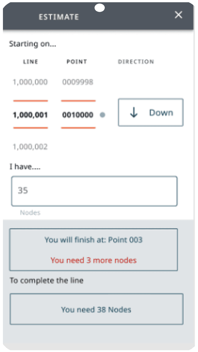
Journey planning
Journey planning
During prototype testing, our field support team introduced the concept of Journey Planning. This feature aids navigation crews in planning their trips, including considerations like the number of nodes to carry and where to drop them off efficiently. This concept was explored but later deemed more suitable for another STRYDE software piece designed for pre-field planning.
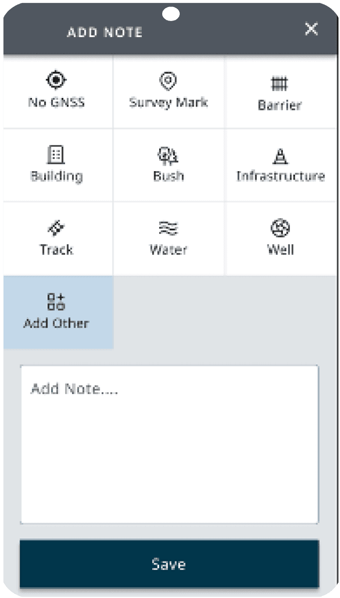
Detailing 'Marked as Skipped' Points We considered a feature that allows navigators to note reasons for skipping specific points, such as impassable terrain or GPS issues. This information could help Data Officers understand why a point was skipped, saving unnecessary field visits. While the idea was widely accepted, further testing and refinement are required.
During prototype testing, our field support team introduced the concept of Journey Planning. This feature aids navigation crews in planning their trips, including considerations like the number of nodes to carry and where to drop them off efficiently. This concept was explored but later deemed more suitable for another STRYDE software piece designed for pre-field planning.
Detailing 'Marked as Skipped' Points We considered a feature that allows navigators to note reasons for skipping specific points, such as impassable terrain or GPS issues. This information could help Data Officers understand why a point was skipped, saving unnecessary field visits. While the idea was widely accepted, further testing and refinement are required.
Accuracy forecasting
Accuracy forecasting
The most commonly reported mistake is Navigators assigning a node to the incorrect point number and continuing that mistake along the line. A heat map showing how accurate each point is would be helpful - and is currently used on our Survey Management software based in the camp. However, for this to be quickly enough identified, navigators would need to be regularly checking plan status - which we know from experience they aren't. We should be looking at solving how/why this happens on the navigation screen.
The most commonly reported mistake is Navigators assigning a node to the incorrect point number and continuing that mistake along the line. A heat map showing how accurate each point is would be helpful - and is currently used on our Survey Management software based in the camp. However, for this to be quickly enough identified, navigators would need to be regularly checking plan status - which we know from experience they aren't. We should be looking at solving how/why this happens on the navigation screen.
The most commonly reported mistake is Navigators assigning a node to the incorrect point number and continuing that mistake along the line. A heat map showing how accurate each point is would be helpful - and is currently used on our Survey Management software based in the camp. However, for this to be quickly enough identified, navigators would need to be regularly checking plan status - which we know from experience they aren't. We should be looking at solving how/why this happens on the navigation screen.
Separate summary
Separate summary
Separate summary
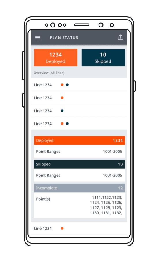
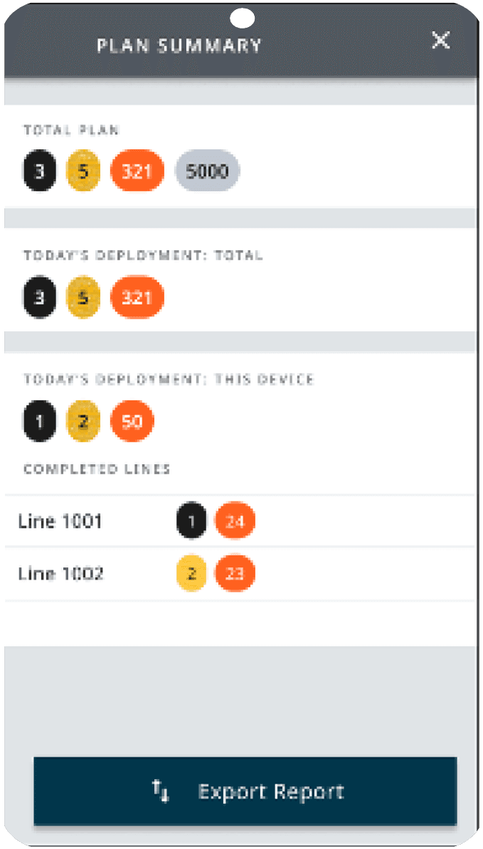
We explored the idea of having a separate summary for the plan by device and by day. This feature would benefit Data Officers and Foremen responsible for reporting to different managers. This essentially becomes an extension of the plan status, offering a comprehensive overview.
We explored the idea of having a separate summary for the plan by device and by day. This feature would benefit Data Officers and Foremen responsible for reporting to different managers. This essentially becomes an extension of the plan status, offering a comprehensive overview.
We explored the idea of having a separate summary for the plan by device and by day. This feature would benefit Data Officers and Foremen responsible for reporting to different managers. This essentially becomes an extension of the plan status, offering a comprehensive overview.


Kirstyn Potter
Lead Designer
Although Sarah is early in her career as a product designer, I have no doubt whatsoever that she will succeed. Her process knowledge, attention to users and requirements is exceptional and she will be an asset to anyone's team. It was an absolute pleasure to work together during my time at STRYDE and I wish her the best of luck for the future.